Overview
How the company is doing, at a glance
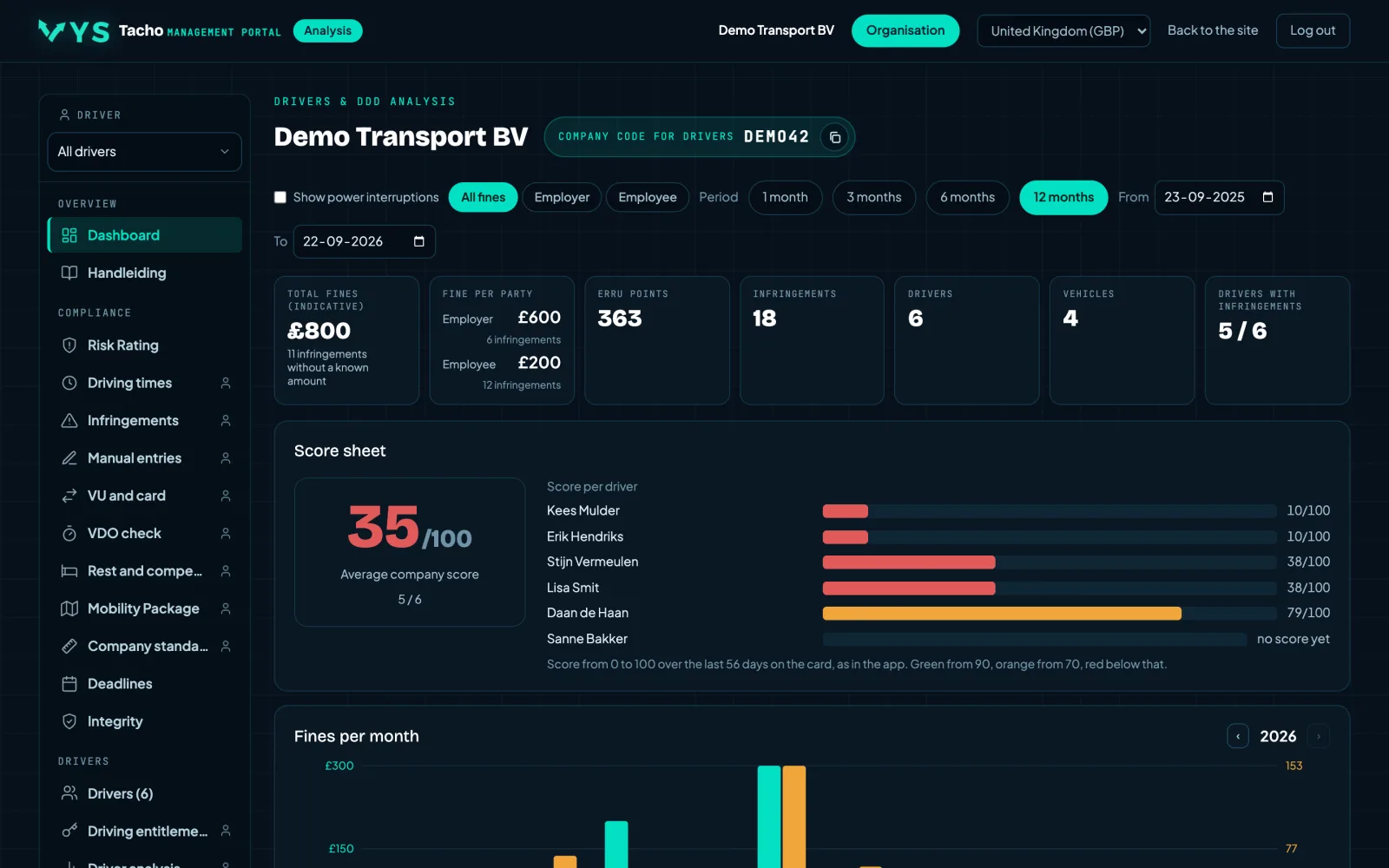
The dashboard adds up the infringements of the whole company and shows the fine indication alongside, split between employer and employee. It also shows the ten drivers with the most infringements and the trend over the past months, so you can see whether things are getting better or worse.
- The total fine indication over a period of your choice, split by who pays it.
- ERRU points and a score from 0 to 100 per driver over the last fifty-six days.
- Click on a driver and you go straight to his analysis.
- A chart showing the trend, so you judge the direction rather than a single figure.
- Tiles with the ERRU score per vehicle and the ILT penalty points against the threshold; one click takes you to the explanation on Risk Rating.
- Long lists collapse after ten rows, so the overview stays an overview.
Please note
The fine amounts are an indication based on the published rates of the selected country. It is not an imposed fine and not a prediction of what an inspector will do.
More in Overview
Other features
OverviewAttention: what is going on this weekEverything that needs attention this week, together: drivers who suddenly score much higher fines than usual...OverviewRisk Rating per vehicleA risk score for the company in the spirit of the EU risk rating system, calculated from the infringements we find in...OverviewILT penalty points and thresholdA separate tab next to the EU risk classification. The same infringements, counted the way the ILT does: 9 points for...
One week free, with your own files
Request a demo and we open the portal for you for a week with the DDD files from your own tachographs and driver cards. That way you see what comes out of the files of your drivers and vehicles. The demo is free of charge.
Request a free demo